 Circunspecter's stuff
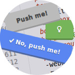
Push me! Buttons
CSS class to simulate button and press effect using some properties of the CSS3 specification.
Base class:
.btn {
    cursor: pointer;
    position: relative;
    top: -3px;
    padding: 10px 20px;
    border-radius: 4px;
    border: 0;
    vertical-align: middle;
    text-decoration: none;
    font-weight: bold;
    background: none repeat scroll 0 0 #bbb;
    color: #444;
    text-shadow: 0 1px 0 rgba(0, 0, 0, 0.4);
    -webkit-box-shadow: 0 3px 0 #999, 0 3px 3px #999;
    -moz-box-shadow: 0 3px 0 #999, 0 3px 3px #999;
    box-shadow: 0 3px 0 #999, 0 3px 3px #999;
    -webkit-border-radius: 4px;
    -moz-border-radius: 4px;
    -khtml-border-radius: 4px;
}
.btn:hover {
    background: none repeat scroll 0 0 #ccc;
}
.btn:active {
    top: -1px;
    background: none repeat scroll 0 0 #ccc;
    -webkit-box-shadow: 0 1px 0 #999, 0 1px 3px #999;
    -moz-box-shadow: 0 1px 0 #999, 0 1px 3px #999;
    box-shadow: 0 1px 0 #999, 0 1px 3px #999;
}
Changing color:
.btn-green {
    background: none repeat scroll 0 0 #77b55a;
    color: #fff;
    text-shadow: 0 1px 0 rgba(0, 0, 0, 0.4);
    -webkit-box-shadow: 0 3px 0 #5d8c46, 0 3px 3px #5D8C46;
    -moz-box-shadow: 0 3px 0 #5d8c46, 0 3px 3px #5D8C46;
    box-shadow: 0 3px 0 #5d8c46, 0 3px 3px #5D8C46;
}
.btn-green:hover {
    background: none repeat scroll 0 0 #86c964;
}
.btn-green:active {
    top: -1px;
    background: none repeat scroll 0 0 #86c964;
    -webkit-box-shadow: 0 1px 0 #5d8c46, 0 1px 3px #5D8C46;
    -moz-box-shadow: 0 1px 0 #5d8c46, 0 1px 3px #5D8C46;
    box-shadow: 0 1px 0 #5d8c46, 0 1px 3px #5D8C46;
}
or
.btn-blue {
    background: none repeat scroll 0 0 #5986F0;
    color: #fff;
    text-shadow: 0 1px 0 rgba(0, 0, 0, 0.4);
    -webkit-box-shadow: 0 3px 0 #4F67A1, 0 3px 3px #4F67A1;
    -moz-box-shadow: 0 3px 0 #4F67A1, 0 3px 3px #4F67A1;
    box-shadow: 0 3px 0 #4F67A1, 0 3px 3px #4F67A1;
}
.btn-blue:hover {
    background: none repeat scroll 0 0 #759AF0;
}
.btn-blue:active {
    top: -1px;
    background: none repeat scroll 0 0 #759AF0;
    -webkit-box-shadow: 0 1px 0 #4F67A1, 0 1px 3px #4F67A1;
    -moz-box-shadow: 0 1px 0 #4F67A1, 0 1px 3px #4F67A1;
    box-shadow: 0 1px 0 #4F67A1, 0 1px 3px #4F67A1;
}
For the cute CSS3 properties reference and browser compatibility, you can take a look at:
comments powered by Disqus