 Circunspecter's stuff
Minimalist jQuery plugin to display content in tabs
Simple plugin to display content in tabs using jQuery (v1.7.1+).
Plugin:
(function($) {
$.fn.minitabs = function() {
return this.each(function() {
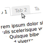
$(this).find('.tabnames li').on('click', $.proxy(function(e){
$(e.currentTarget).addClass('activetab').siblings().removeClass('activetab');
$(this).find('.tabcontent').removeClass('activetab').eq($(e.currentTarget).index()).addClass('activetab');
}, this)).eq(0).trigger('click');
});
};
})(jQuery);Basic HTML Structure:
<div class="minitabs">
    <ul class="tabnames">
        <li>Tab 1</li>
        <li>Tab 2</li>
        <li>Tab 3</li>
    </ul>
    <div class="tabcontent">Tab 1 - Content</div>
    <div class="tabcontent">Tab 2 - Content</div>
    <div class="tabcontent">Tab 3 - Content</div>
</div>
The plugin does not require that the structure have to be as shown, you can add and wrap tags.
CSS (IE6+ friendly):
.minitabs .tabnames{
    margin: 0;
    padding: 0;
    zoom: 1;
}
.minitabs .tabnames li{
    list-style: none outside none;
    display: block;
    float: left;
    position: relative;
    left: 0;
    top: 1px;
    margin-left: 5px;
    padding: 5px 10px;
    color: #999;
    background-color: #fff;
    border: 1px solid #ccc;
    cursor: pointer;
}
.minitabs .tabnames .activetab{
    border-bottom-color: #fff;
    color: #333;
}
.minitabs .tabcontent{
    display: none;
    clear: left;
    padding: 10px;
    background-color: #fff;
    border: 1px solid #ccc;
}
.minitabs .activetab{
	display: block;
}JS:
$(".minitabs").minitabs();The above example, after passing through "Lorem ipsum", would be:
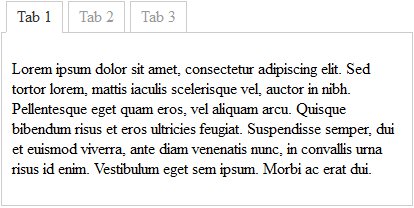
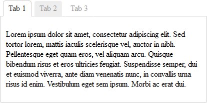
Of course you can modify the appearance and make it as nice as the user's browser allows. For example, appending the following class together with the existing one "minitabs".
CSS:
.some-pritty-changes .tabnames li{
    background-color: transparent;
    border-color: transparent transparent #ccc;
    border-style: solid;
    border-width: 1px;
    -webkit-border-radius: 5px 5px 0 0;
    -moz-border-radius: 5px 5px 0 0;
    -khtml-border-radius: 5px 5px 0 0;
    border-radius: 5px 5px 0 0;
}
.some-pritty-changes .tabnames li:hover{
    background-color: #eee;
}
.some-pritty-changes .tabnames .activetab{
    color: #333;
    background-color: #fff;
    border-color: #ccc #ccc #fff;
}
.some-pritty-changes .tabnames .activetab:hover{
    background-color: #fff;
}
The outcome:
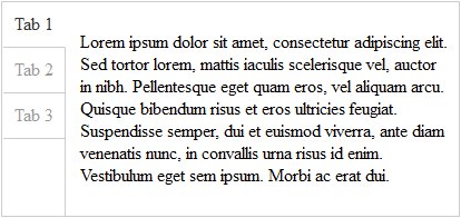
Another example showing the tabs vertically and changing the class name:
CSS:
.verticaltabs{
    overflow: hidden;
    border: 1px solid #ccc;
}
.verticaltabs .tabnames{
    float: left;
    margin: 0 0 -99999px;
    padding: 0 0 99999px;
    border-right: 1px solid #ccc;
}
.verticaltabs .tabnames li{
    list-style: none outside none;
    display: block;
    position: relative;
    left: 1px;
    top: 0;
    padding: 10px;
    color: #999;
    border-right: 1px solid #ccc;
    border-bottom: 1px solid #ccc;
    cursor: pointer;
}
.verticaltabs .tabnames .activetab{
    border-right: 1px solid #fff;
    color: #333;}
.verticaltabs .tabcontent{
    display: none;
    padding: 10px;
    margin-left: 60px;}
.verticaltabs .activetab{display: block;}